Blaze Beauty
An unconventional cosmetics line that redefines beauty with bold and timeless approach to sustainable design
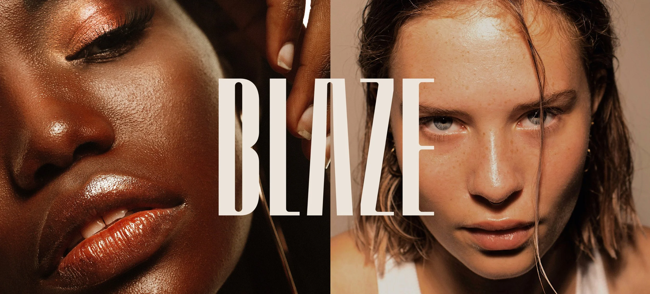
BRAND STORYBlaze Beauty is a revolution in cosmetics—a bold, unapologetic brand that breaks the mold with design that makes a statement and functionality that stands the test of time. Forget throwaway products. Blaze transforms your beauty ritual into something unforgettable, turning everyday essentials into keepsakes. Blaze’s refillable solutions and sustainably crafted materials are about making conscious choices that don’t compromise on luxury. Blaze is where beauty becomes an unconventional experience that lasts.
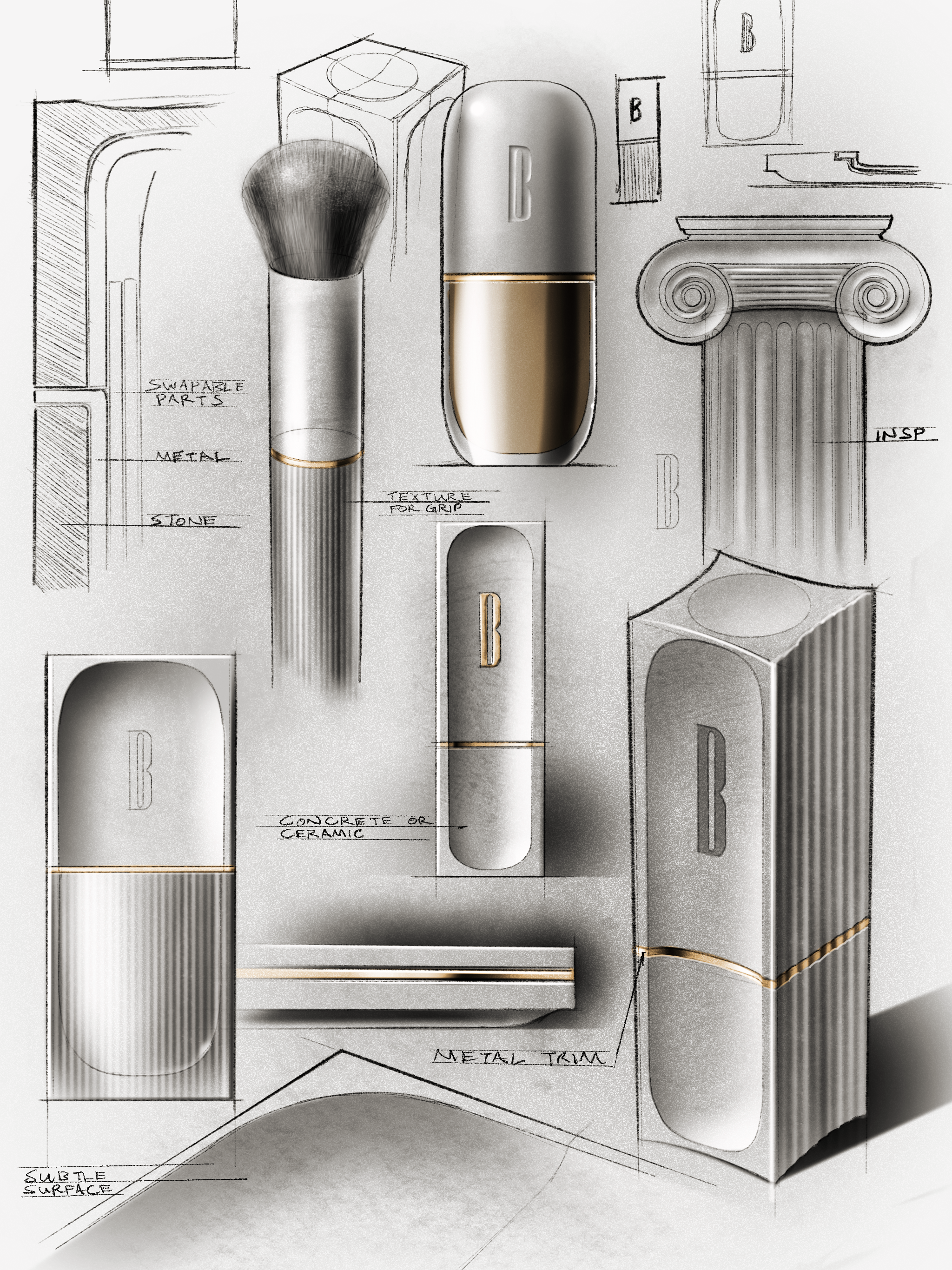
THE CHALLENGEThe development of Blaze Beauty was a collaborative effort between our brand and industrial design teams, working cross-functionally to redefine sustainable beauty. Together, we set out to create a cosmetics line that challenges industry norms, using raw and real sustainable materials like ceramic and stainless steel to make a bold statement. Sustainability was woven into every detail, with refillable solutions designed to reduce waste and minimize the industry’s environmental impact. As the product line took shape, our brand design team developed a striking identity that seamlessly aligned with the innovative packaging, ensuring a consistent, impactful presence across packaging and user experience.
TIMELINEProduct Design – 5 weeks
Brand Design – 3 weeks
Brand Strategy
Industrial Design
Product Innovation
Packaging Design
Brand Identity
Product Visualization
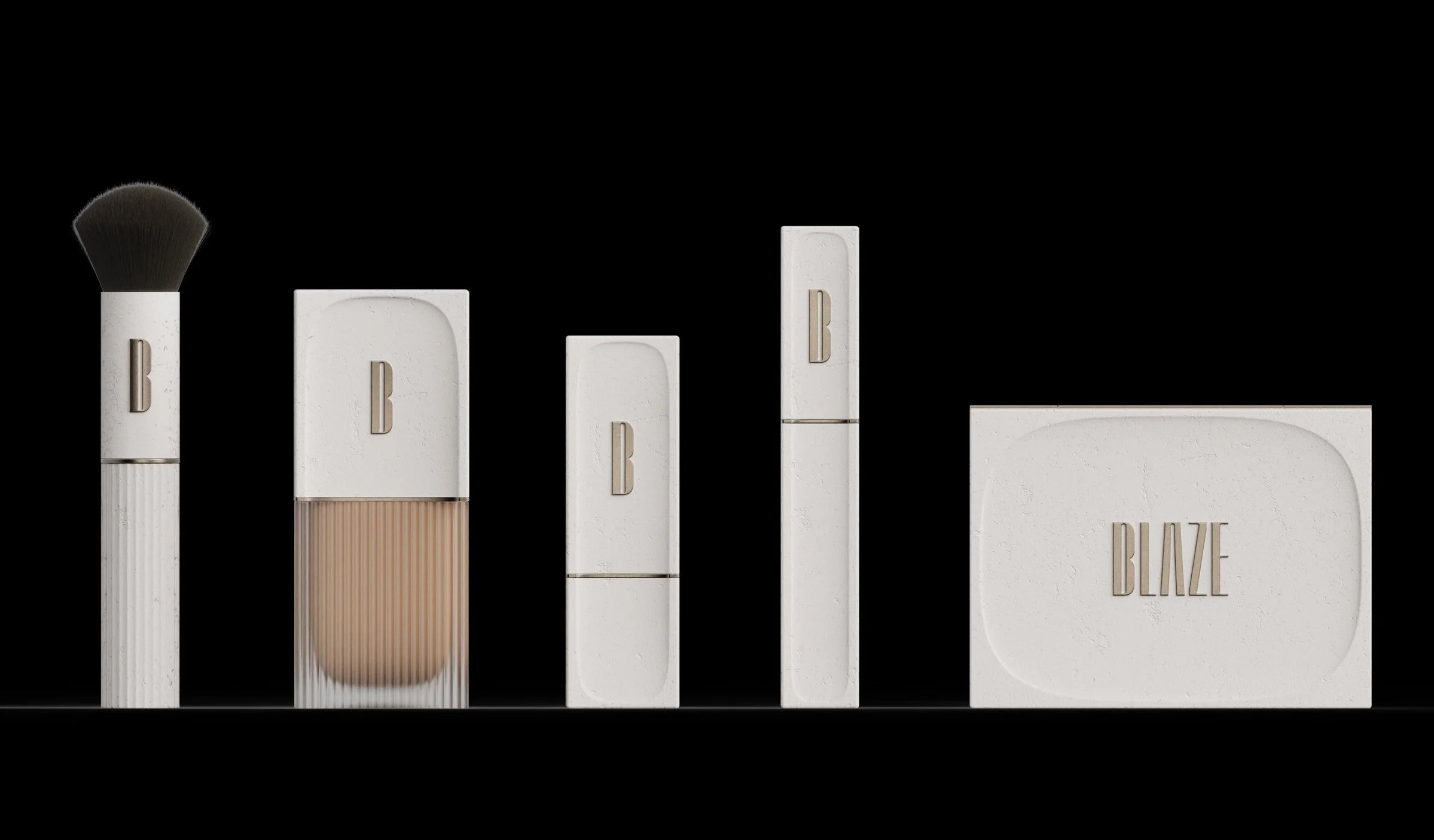
COMPACT BRUSHFOUNDATIONLIPSTICKMASCARACOMPACTTARGET PERSONAThe Trailblazer
Confident and conscious, they seek beauty products that align with their values of authenticity and sustainability. They prioritize timeless design, innovative functionality, and ethical practices, embracing a beauty routine that reflects their individuality while caring for the planet.
DEMOGRAPHICSKEY CHALLENGESMen / women
25-35 year olds
Environmentally conscious
Urban dwellers
Balancing aesthetics with environmental responsibility
Frustration with wasteful packaging and short-lived products

BLAZE STORYA sustainable cosmetics collection that redefines beauty through timeless design, innovative materials, and conscious living.
BRAND DESIGNLogo & Visual Identity
The design of the Blaze logo and visual identity reflects the brand’s commitment to sustainability and authenticity, drawing inspiration from the sleek, timeless design of the product family. This approach resulted in the creation of a refined visual identity system, where each product’s design influences the overall brand aesthetic, ensuring a cohesive and impactful presence across all touchpoints.
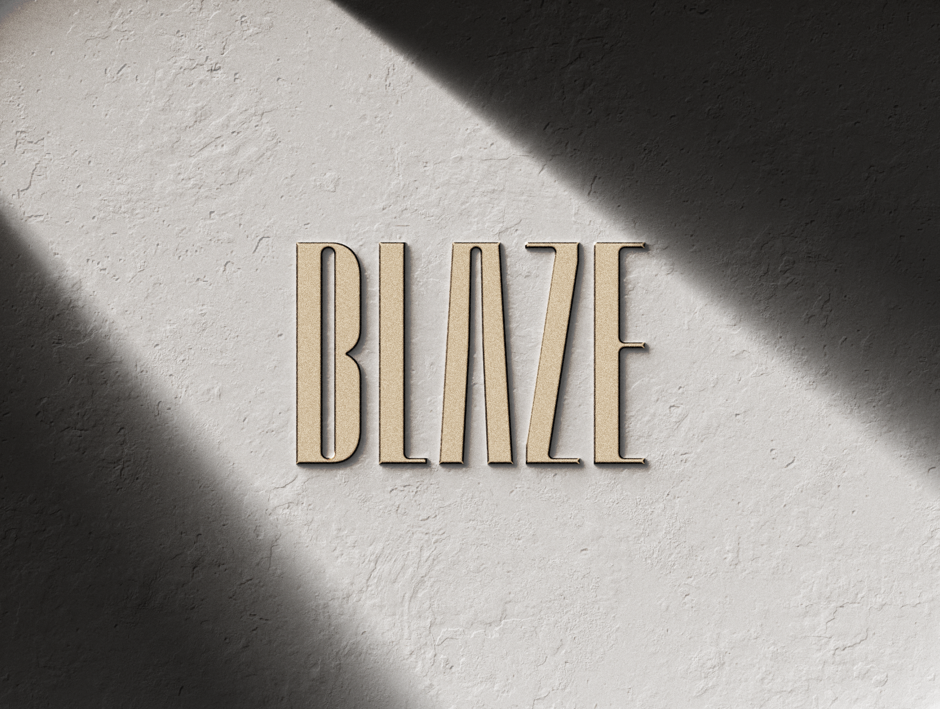
LOGO DESIGNThe Blaze logo captures the brand’s bold, pioneering spirit with elongated letterforms that exude confidence and sophistication. Its sharp angles and subtle curves reflect the balance of refinement and resilience found in Blaze products.
Inspired by the durable ceramic and stainless-steel materials, the logo’s vertical emphasis symbolizes strength and timelessness. This design reinforces Blaze’s commitment to sustainable beauty, creating a visual identity as enduring and authentic as the brand itself.
TIMELESSSustainability
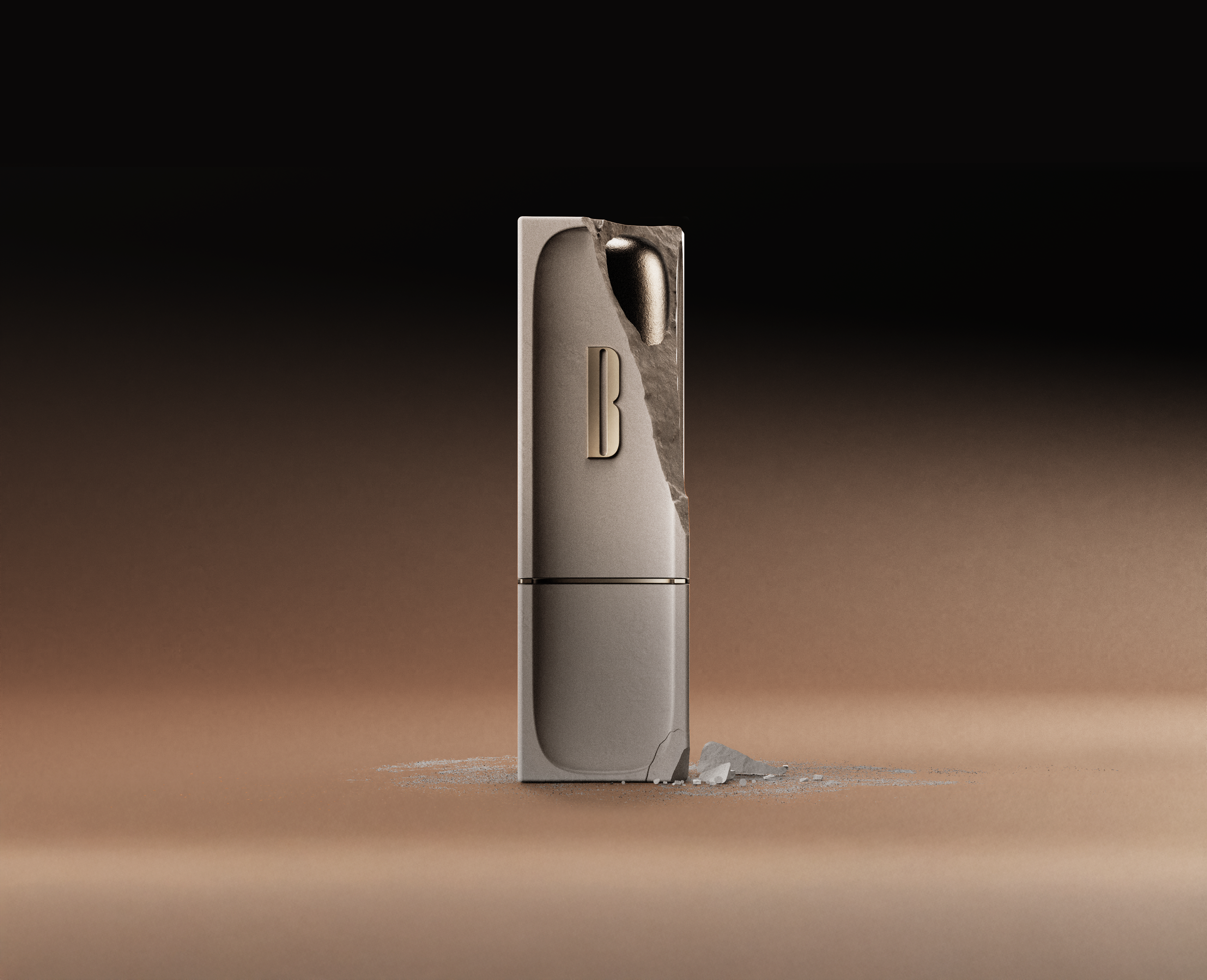
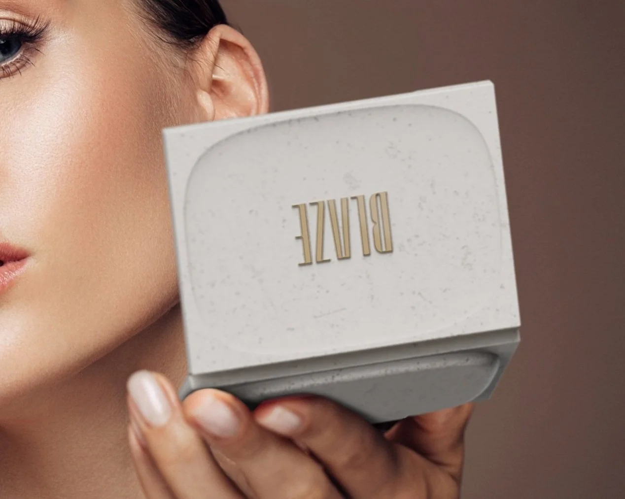
Blaze products combine ceramics and stainless steel to create durable, elegant beauty essentials. Ceramics provide a tactile, biodegradable touch, naturally cracking and crumbling over time to give each product a one-of-a-kind appearance. Paired with stainless steel for structural integrity and a sleek aesthetic, this materiality embodies Blaze’s commitment to sustainability, offering products that evolve uniquely while reducing environmental impact.
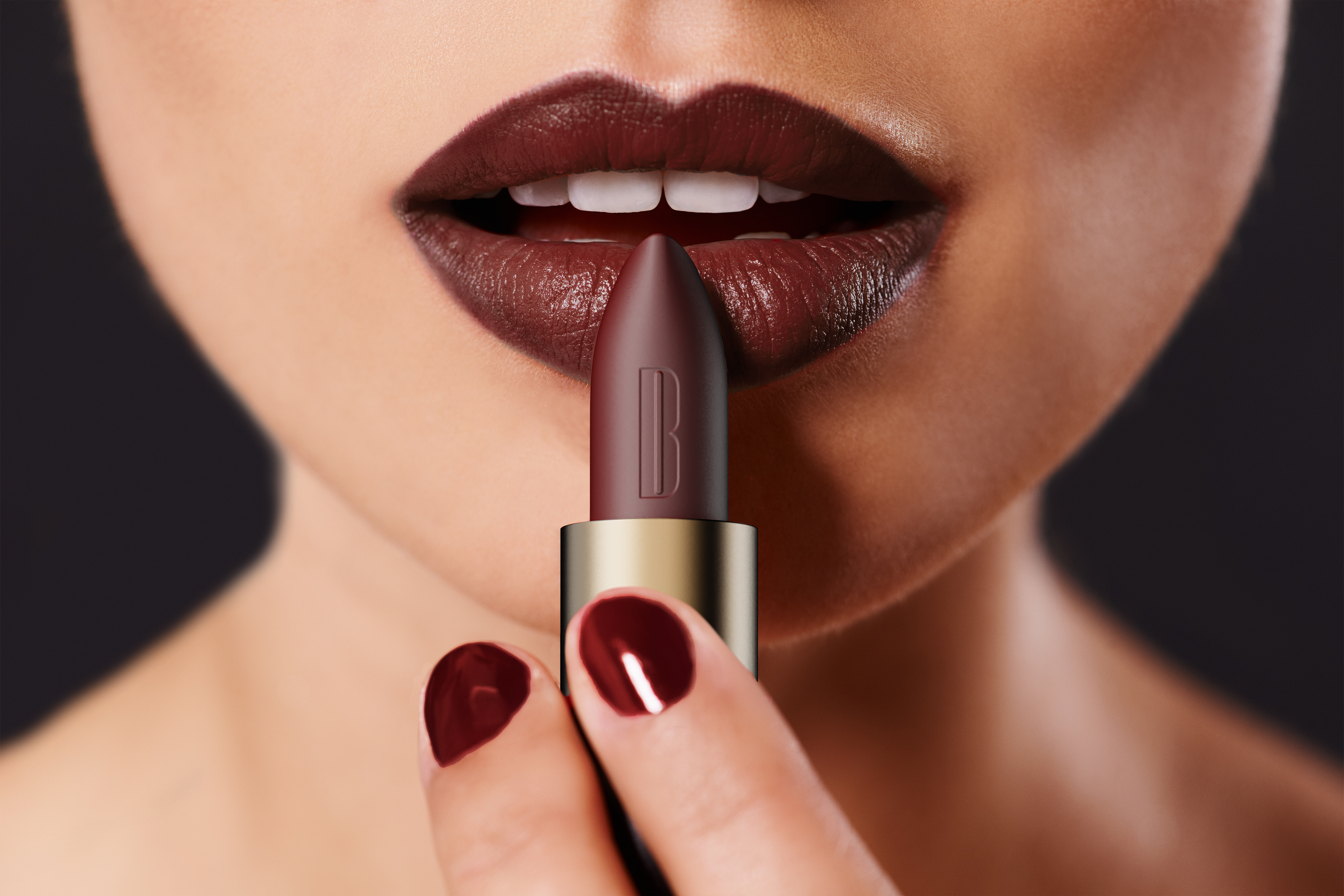
IGNITELipstick
Ignite Lipstick blends bold, lasting color with timeless elegance, embodying Blaze’s commitment to beauty and environmental responsibility.
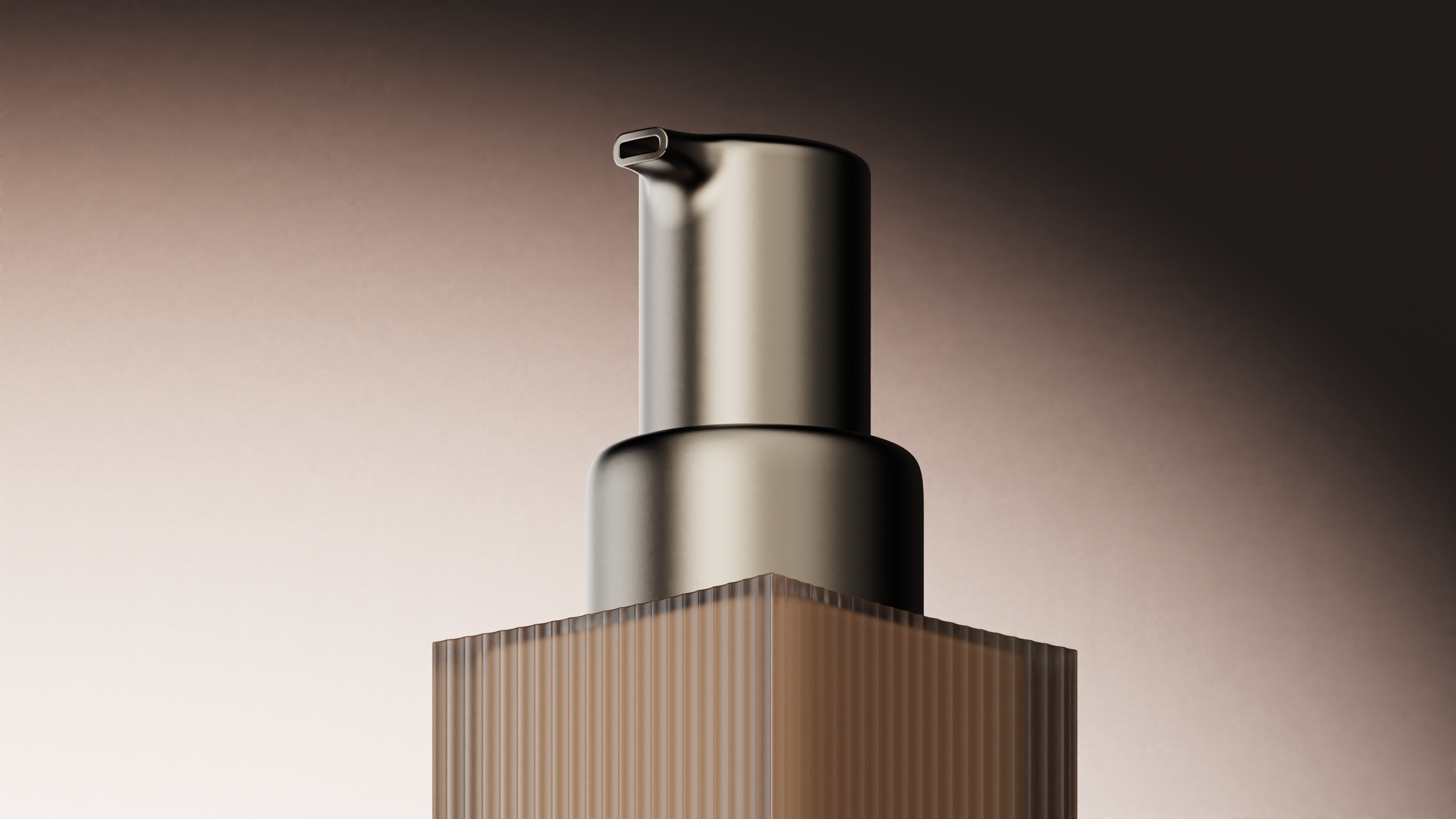
LUSTREFoundation
Lustre Foundation delivers flawless, natural coverage with a focus on sustainability and sophistication, reflecting Blaze’s dedication to authentic beauty and environmental care.
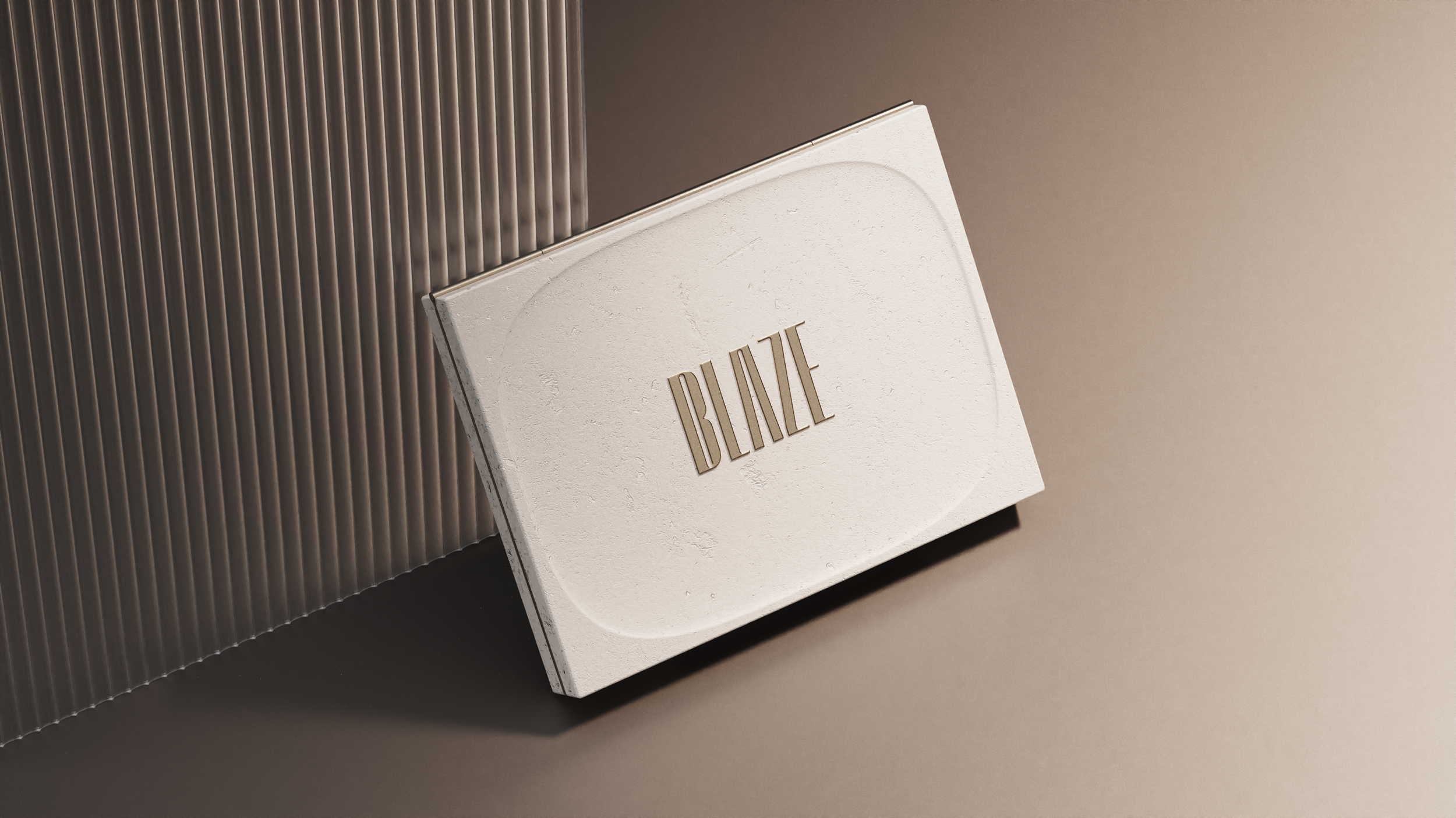
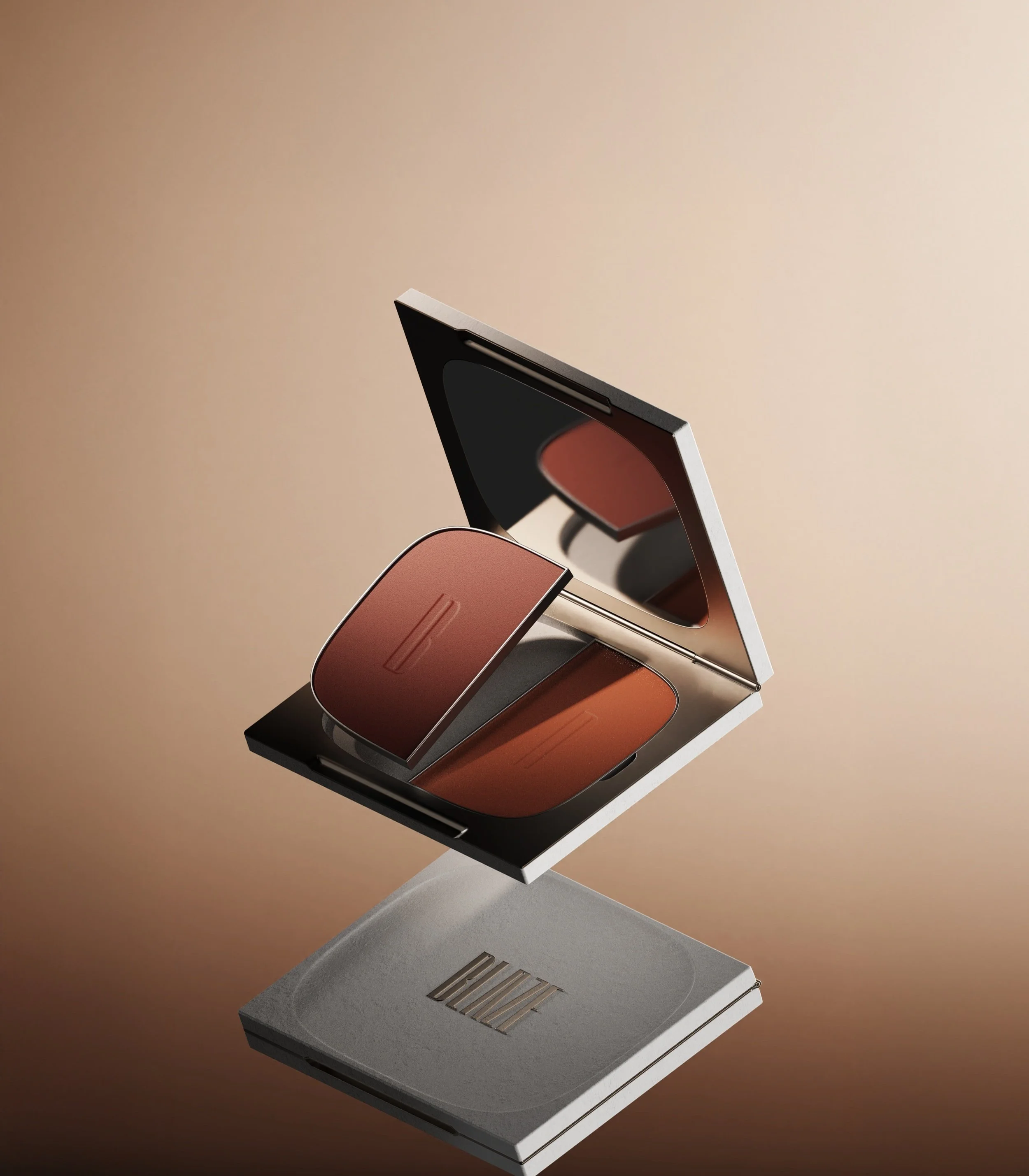
HALOCompact
Halo Compact combines timeless design with refillable functionality, offering a sustainable and elegant solution for on-the-go beauty, true to Blaze’s ethos of authenticity and environmental care.
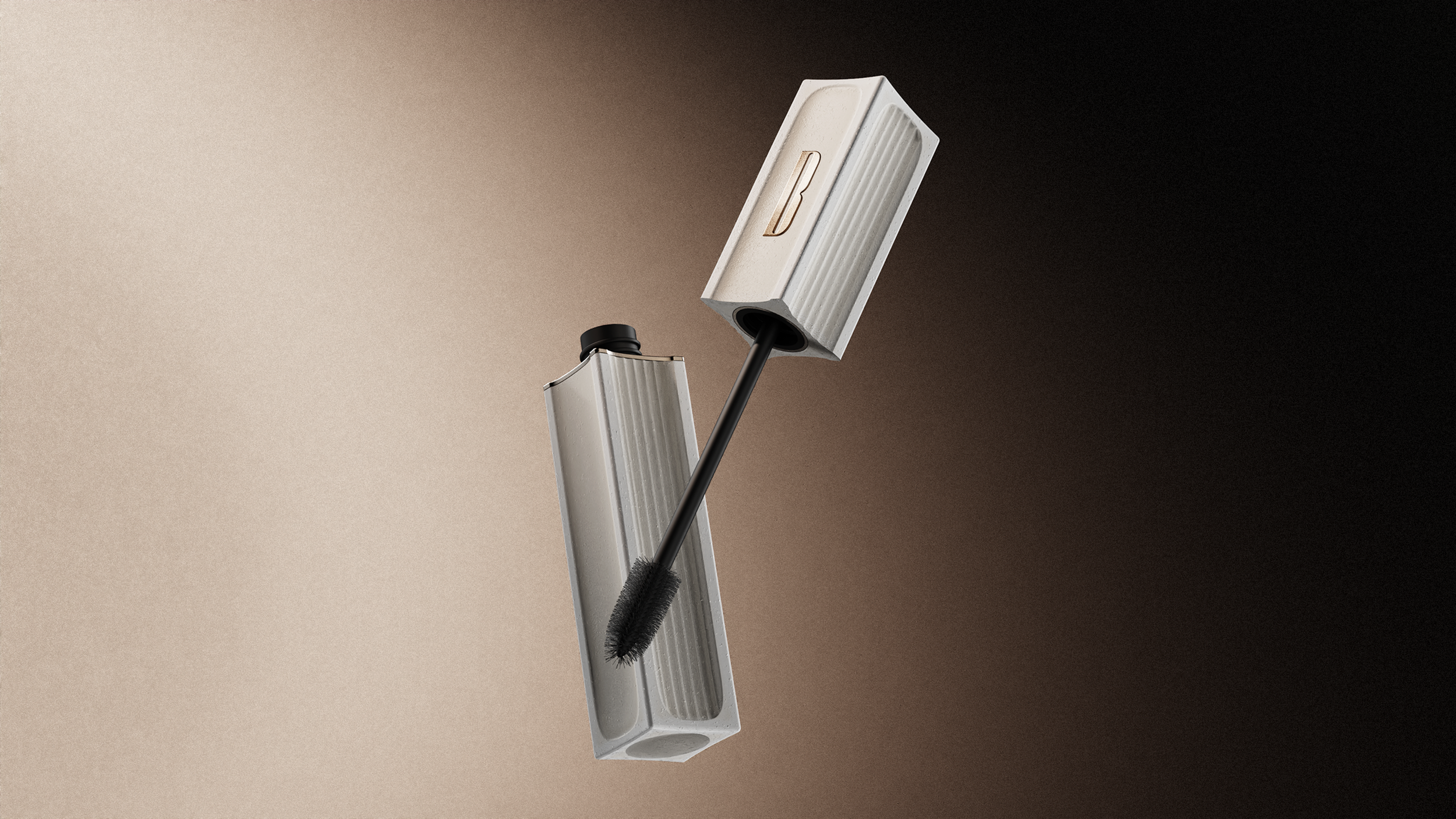
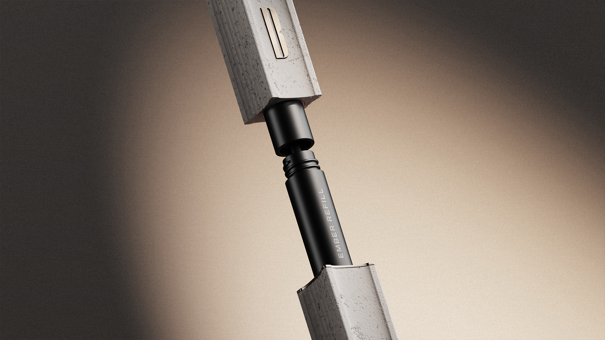
EMBERMascara
Ember Mascara enhances lashes with bold definition and lasting impact, embodying Blaze’s commitment to sustainable design and timeless elegance.
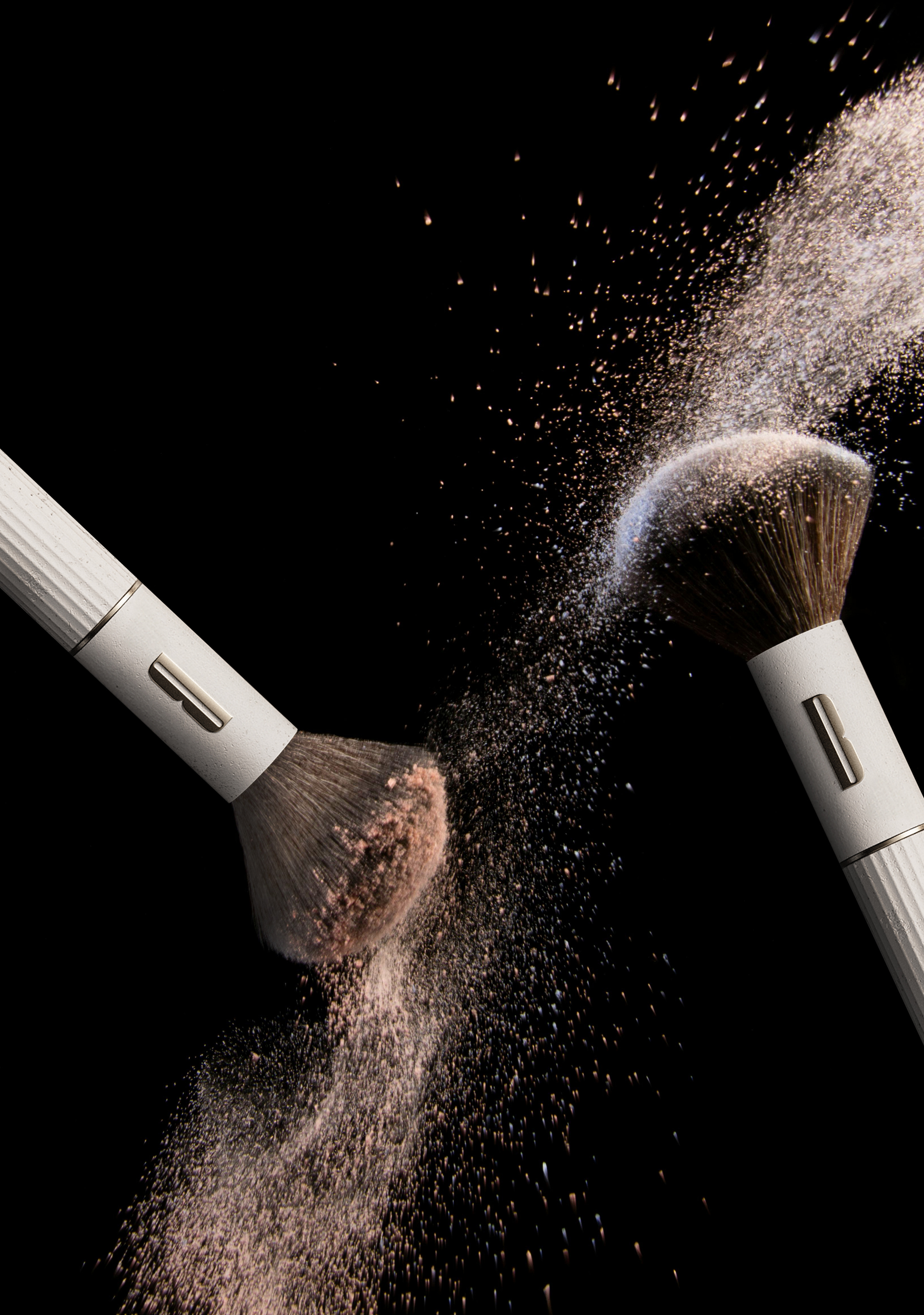
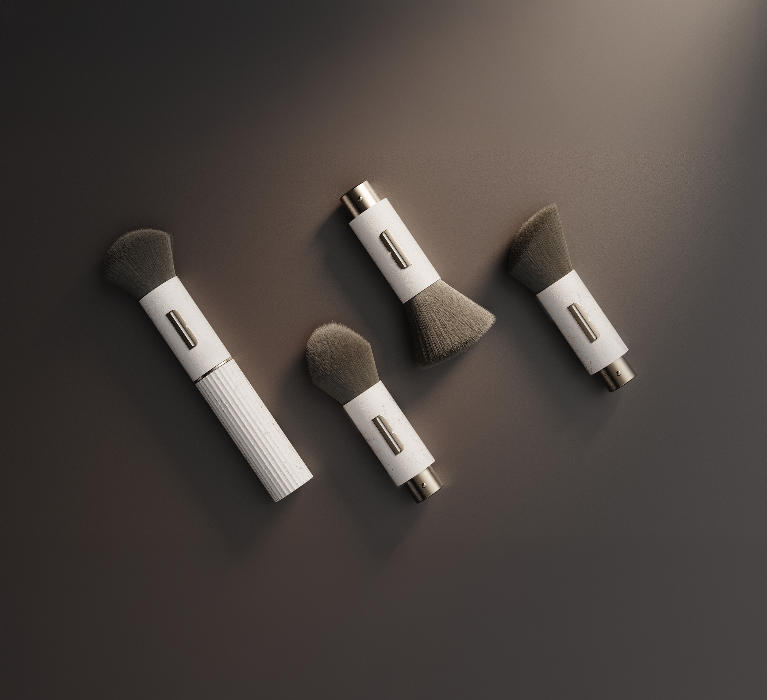
FLAREBrush
Flare Blush adds a natural, radiant touch to your look while embodying Blaze’s commitment to sustainable design and timeless elegance.

